Wednesday, March 31, 2010

On branches and subtle hues


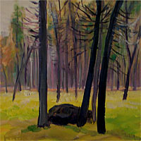
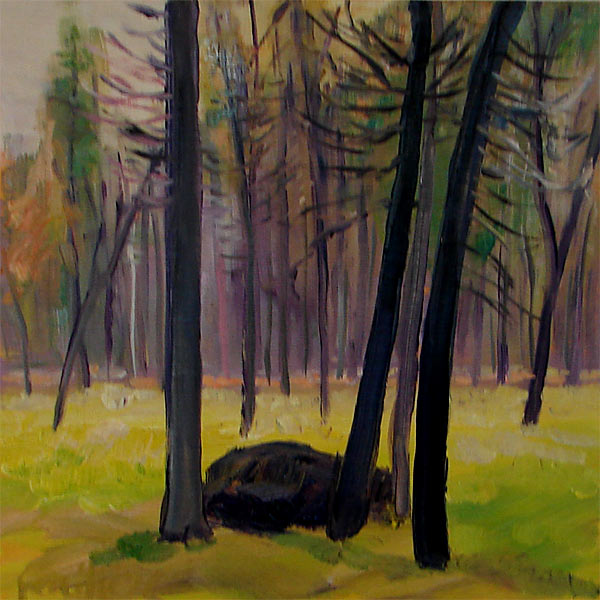
There is something about a grove of trees that gives me a quiet and introspective feeling. This is often the reason I feel the need to "get outside" - that sense of perspective that comes from finding a quiet, branchy place to re-order my thoughts. Tree shapes in a painting naturally evoke a sense of peaceful connectedness for me. Incidentally, this habit of studying tree shapes has made me a bit of a visual xylologist. Oh, how I do love trees, trees and fancy words!

It's funny how nature can be so disorderly. Trees rarely grow up in a straight vertical line, with the exception of palm trees, perhaps. More often the elements push them in different directions, causing no two trees to grow in exactly the same way. Then there is the leftover branch and foliage matter that collects up in the wild. Wolf Kahn often refers to these as "tangles" in his pastels of forested places. They can form beautiful masses of curvilinear lines that are impossibly complicated.

When faced with a tangle and many complex tree shapes, I like to adjust the pallet so that the shapes stand out more. These two paintings seemed to require muted pallets to properly evoke a sense of quiet. I've tried forest paintings in hues of cadmium red, only to end up with little forest fire paintings. It's the wrong mood. No, a forest needs blues and greens, with only perhaps a hint of peach or violet.

Tuesday, March 30, 2010

Old and new, lots of borrowed and blue

Communication
Recently I redesigned my entire web site, which was a major undertaking due to the accumulation of images in the "sold" category. Yes, I know, wa wa wa. Poor me, so much sold work! Seriously, though, there were about 300 image files to sort through. It proved to be a great way to get an overview of my body of work. I had to select only 64 images to represent my "sold" body of work, so I got to thinking about the all time favorite pieces.

One of them is this little abstract number called "Communication". I say little, but actually it's 4 feet wide and 2 feet tall. It was one of the first pieces ever sold through a gallery, so I don't even know where it went, *sniff*. It never writes or calls, either!

The title was a function of things I was going through at the time on a personal level. It had to do with relationships, vulnerability, and the magic of being able to look in someone's eyes and see a whole universe in there staring back at you. There is a entire world in each person that sometimes can be surprising.

Aloha Vista
My new favorite piece, "Aloha Vista", is about space and possibilities. Most of my landscape compositions have featured intimate little wooded places. I've always had a fondness for those hidden spaces people go to find themselves again and reconnect with their own higher nature. It was a little breakthrough to discover this spot on top of a hill where you could actually see all the way to the ocean. There was all that exposure and yet still there was that sense of intimacy and connectedness.

Sunday, November 15, 2009

Reflecting on Reflections


Lately I've been trying to explain to myself why it is that reflections on water are so captivating. This lead me down the path of analyzing the crap out of my own paintings, which is always a little bit dangerous. Intense scrutiny of my own work has historically led to something getting sanded down and painted over. I've since learned that sanding a painting is extremely dangerous due to the heavy metals in the pigments All you artists out there, beware of sanding anything with cadmium in it.

Scrutinizing my work has lately proved more useful and less potentially carcinogenic. Staring at my compositions, I realized that many reflections are basically double images. One side of the double is created by an environment of air and the other by water. The air image is usually lighter, more clear, and shapes are more reasonable, compact. The water images tend to be inky with higher contrast. Shapes are distorted, sometimes growing a little wild. Oooh, a chance for some crazy fun brushwork! Water gives me permission to go a bit more wild with color, contrast and shape. Claude Monet once said that you could find every color imaginable in a reflection.

In many ways reflections are also like dreaming. A body of water is also a reflection of another world. This one is familiar, but it has a few alterations of hue and geometry that give a sense of distortion. Similarly, experiences in the day are often amplified or altered in our dreams.

I've always felt that dreams were important. At times in my life, mine have proven to be extremely prescient. Sometimes it's as though I could sense a life tsunami approaching through my dream imagery. I sometimes work out things I can't figure out when I'm awake. I've even met people in my dreams before we actually met in "awaketime".

Some of these assertions may sound nuts, but at least I'm not alone in my nuttiness. Many cultures have based a huge part of their art around a dream world or space. The Aboriginal tribes of Australia believe that what you do when you are asleep is as important as in your wakeful state, so the "dreamtime" art is a way of describing what happens in that important eyes-closed state. The Egyptians had an entire body of art that described what happened in the land beyond sleep, the eternal sleep as it were.

Speaking of sleep...I could really use some! Sweet dreams, everyone.